Designing for a Display That Isn’t a Typical Display
Transparent LED film is one of the most elegant display technologies available today. Ultra-thin, flexible, and nearly invisible when powered off, a transparent LED film screen transforms ordinary glass into vibrant digital media, without blocking visibility, natural light, or architectural aesthetics.
However, content for a LED transparent film screen must follow a completely different visual logic compared to traditional LED walls. Designers must consider pixel pitch, background environment, reflections, and how the viewer sees the real world plus digital content simultaneously.
This guide provides a practical framework to help designers, marketers, and creative teams produce world-class visuals for transparent LED film across retail, architecture, museums, and corporate spaces.
How Transparent LED Film Actually Displays Content
Transparency Means the Background Is Part of the Canvas. What are the key features of transparent led film,
here are the brief answers:
- Transparent PET/TPU substrate
- Embedded micro-LEDs
- Nearly invisible conductive paths
- Pixel pitches from P6 to P30
- Transparency levels from 70–95%
Viewers are always seeing multiple layers at once—your digital content, the glass itself, the real environment behind it, and any reflections on the surface, so every visual must be strong enough to compete within that stacked, semi-transparent scene.
How does transparent led film work in different lighting conditions?
Lighting conditions heavily influence how a transparent film led screen appears. On transparent LED film, your biggest “background layer” isn’t black—it’s real life: sunlight, reflections, passing cars, people, and interior lighting. In bright daylight, soft colors and fine details get washed out, so bold shapes, saturated colors, and strong contrast are essential. At night, the display feels richer and more cinematic, allowing for more subtle gradients and moodier visuals. In simple terms: the environment is part of your screen, so every piece of content should be designed to stand out against changing light, not just look good in a dark studio preview.
Creative Rule #1: Use Macro Imagery
Macro imagery is the single most important creative tool for led transparent film screen.
On a transparent led film screen, macro imagery always outperforms small, detailed visuals. Because the pixel pitch is wider and the viewer can see the real environment behind the glass, thin lines, tiny icons, and intricate textures quickly lose clarity or vanish altogether. Large silhouettes, bold product close-ups, oversized shapes, and simple compositions survive low pixel density and mixed backgrounds, delivering strong impact whether the viewer is one meter or ten meters away.
| Best Macro Elements | Avoid |
| ✔ Product silhouettes ✔ Ingredient close-ups ✔ Large geometric shapes ✔ Abstract flowing forms ✔ Bold colorful scenes | ✘ Portraits with fine features ✘ Fabric texture ✘ Complex patterns ✘ Micro-detail photography |
Creative Rule #2: Boost Local Contrast, Not Just Global Contrast
LED transparent film screen doesn’t give you a solid black background to lean on—black areas simply become invisible. That means you can’t rely on global contrast alone; you need strong local contrast inside each object, logo, or text block. Use bright elements against darker shapes, solid containers behind text, and clear color separation within each visual unit. This ensures content stays legible even when the background changes from sky to street to interior lighting.
Creative Rule #3: Add Soft Drop Shadows to Anchor Objects
Because content appears to float on glass, it can sometimes feel disconnected from the physical environment. Soft drop shadows help “anchor” visuals to the transparent surface, improving readability without making the design feel heavy. A subtle, blurred shadow behind text or key elements adds depth, boosts local contrast, and creates a gentle halo that separates your content from whatever is happening behind the window.
Benefits:
- Improves readability
- Increases depth
- Reduces shimmer
- Enhances outline visibility
Creative Rule #4: Favor Darker, Cinematic Palettes
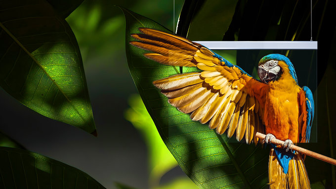
Darker color palettes work exceptionally well on transparent film, particularly in low-light or nighttime conditions. Deep blues, charcoals, purples, and rich gradients allow bright and saturated pixels to stand out crisply, while also maintaining a luxurious, high-end feel. On a transparent film led screen, dark backgrounds with controlled highlights and neon accents look far more refined and readable than large areas of white or very light color, which can bloom and reduce perceived sharpness.
Creative Rule #5: Avoid Fine Textures That Shimmer
Fine textures and high-frequency patterns—like hairline grids, tiny stripes, fabric weaves, or noise-heavy backgrounds—are risky on a led transparent film display screen. The combination of pixel spacing, viewing angle, and movement often turns these details into flickering or shimmering artifacts that feel distracting and unpolished. Instead, favor smooth gradients, broad color fields, soft organic textures, and clean vector forms; these render much more stably on transparent led film and preserve the premium visual experience you’re aiming for.
| Avoid: | Use instead: |
| ✘ Diagonal lines ✘ Tight stripes ✘ Dotted or grid patterns ✘ High-frequency textures | ✔ Soft gradients ✔ Bokeh ✔ Large organic textures |
Typography Guidelines for Transparent Film LED Screen
Typography behaves very differently on a transparent LED film screen compared to traditional LED walls or LCD displays. Because the background is never a solid color—and because the pixel pitch is much wider—text must be designed with clarity, boldness, and environmental variability in mind. The goal is not just readability, but stability and visual harmony with the real world behind the glass.
1.Use bold, high-weight fonts.
Thin or light-weight fonts fall apart due to wide pixel spacing, especially when viewed from the side or at a distance. Bold or extra-bold sans-serif typefaces provide the structural thickness needed to survive the gaps between LEDs. Highly recommended font styles include condensed bolds, geometric sans serifs, and clean grotesques.
2.Avoid serif and decorative fonts.
Serifs, flourishes, and thin stroke variations shimmer on transparent film and often produce moiré effects when the viewer moves. Stick to clean sans-serif families like Helvetica Now, Inter, Montserrat, or Gotham. Their consistent stroke weights maintain legibility and reduce visual noise.
3.Increase letter spacing for clarity.
Because pixel density is lower, characters can feel cramped or visually merge together. Adding 5–15% extra tracking helps letters “breathe” and improves readability from multiple distances. Slight spacing adjustments can dramatically improve how text sits against an unpredictable background.
4.Use text containers when necessary.
If the environment behind the glass is visually active—passing cars, dynamic shop interiors, or reflective surfaces—text may require a semi-opaque container, a soft dark lozenge, or a halo glow. These subtle helpers create local contrast, making text readable without compromising transparency.
5.Keep messaging short and impactful.
Transparent LED film is not designed for paragraphs or dense informational content. Short phrases, bold headlines, single-word statements, or logo lockups translate best. The shorter the text, the stronger the visual impact.
6.Avoid white on its own; anchor it with contrast.
Pure white text can bloom or appear washed out in daylight. Pair it with dark containers, halo glows, or outline strokes for stability. White-on-dark works far better than white directly against a bright outdoor background.
Overall, typography for transparent LED film must be bold, simple, high-contrast, and architecture-aware. Treat text not just as a graphic element but as part of a layered visual environment where clarity depends on both design choices and the real-world setting behind the display.
Choose Smooth, Elegant Movement
Movement on a LED transparent film display screen must complement the natural clarity and openness of the glass surface. Because viewers can see through the display, animations that are too fast, sharp, or chaotic can overwhelm the eye and create visual noise. Smooth, elegant motion feels premium, blends more naturally with the environment, and preserves the illusion of content “floating” in space.
Elegant movement is not just a stylistic choice—it is a technical necessity for transparent LED film, where pixel spacing and environmental lighting amplify every motion artifact.
Why Smooth Motion Works Best
- Reduces flicker and strobing caused by sparse pixel grids
- Prevents moiré-like artifacts during fast transitions
- Helps content appear more stable and readable from multiple angles
- Enhances the premium, architectural feeling associated with transparent displays
- Allows the real background and digital content to coexist without competing
Use Soft Transitions
Transitions on a transparent LED film screen must feel natural and effortless. Because the viewer sees both digital content and the real-world background simultaneously, harsh cuts or rapid, high-contrast changes can feel jarring, cause flickering, or break the illusion of depth. Soft transitions blend digital elements into the environment, making the content appear as if it’s part of the glass rather than sitting on top of it.
These integrate naturally with the real world behind the screen.
LED Transparent Film Display Screen For Different Installation Scenarios
| Retail Storefront Windows | Airports and Public Venues | Museums & Cultural Spaces | Corporate Lobbies & Architecture |
| Best for: ✔ Product silhouettes ✔ Seasonal campaigns ✔ Animated graphic lines ✔ Statement hero visuals ✔ Luxury brand ambient loops | These environments demand clarity: ✔ Icons ✔ Direction arrows ✔ Timed animations ✔ High-contrast graphics | Creative direction: ✔ Ambient storytelling ✔ Transparent layers ✔ Slow animations ✔ Floating text labels | Great options: ✔ Abstract visualizers ✔ Brand colors ✔ Digital water, fire, clouds ✔ Organic shapes |
| Avoid small text or intricate visual detail. | Avoid heavy gradients or experimental patterns. | Avoid micro-patterns or overly dense visuals. | Avoid marketing-heavy content. |
Learn more about why are led transparent film screens suitable for high-traffic areas.
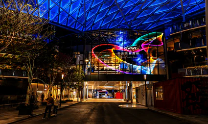
Brightness vs. Transparency Trade-Off
Effective design choices include:
- Large silhouettes instead of small objects
- Strong contrast between foreground and background
- Deep, cinematic colors that hold up in daylight
- Macro imagery with clear shapes and high saturation
- Solid or semi-transparent containers behind text
Black areas become invisible, not “dark.”
On a transparent LED film screen, black pixels do not emit light—and because the substrate itself is clear, any region of the video that is pure black simply becomes see-through. There is no “black background” as on traditional LED panels. Instead, the viewer sees the real environment behind the glass. This means black is not a design color; it is effectively an absence of pixels that reveals the physical world. Designers must therefore avoid relying on black to form shapes or depth unless they intend those regions to disappear completely.
Subtle details disappear.
Because transparent LED film has wider pixel pitches and fewer LEDs per square meter, fine elements—such as thin strokes, micro-textures, detailed patterns, and small typography—do not render with clarity. These visual elements lack the pixel density needed to be recognizable. When displayed, they either become faint, lose their definition, or visually collapse into simplified shapes. Designers must favor bold, high-contrast, macro-level imagery to ensure the content remains legible at various distances and under different lighting conditions.
Fine textures flicker or shimmer.
High-frequency textures (stripes, grids, fabric weaves, hairlines, or repeated patterns) interact poorly with the physical gaps between LEDs, creating moire effects and shimmering when the viewer moves or when the camera pans. This is especially noticeable on transparent substrates where ambient light variation enhances the interference pattern. Instead of small repetitive details, designers should use smooth gradients, broad color fields, soft organic forms, and clean vector graphics to maintain visual stability.
Pixel Pitch Defines the Limits
Transparent LED film has wider pixel spacing than traditional LED cabinets.
- P6–P10: best for storefronts, where these are the most popular pixel pitches for retail windows and glass façades.
- P10–P15: ideal for indoor atriums and public lobbies, for medium pixel pitches provide higher transparency and work particularly well in indoor spaces with controlled lighting.
- P20–P30: Ultra transparent film LED screens for architecture, these ultra-wide pixel pitches are used when the priority is architectural purity and maximum transparency.
For designers, this means:
| Avoid: | Use instead: |
| Thin shapes Small text Fine lines Micro textures Small faces or icons | Bold shapes Macro imagery Simple geometry Large silhouettes |
Conclusion
Great transparent LED film content is bold, simple, and designed to work with the real world behind the glass, not against it. Follow these five golden rules, and your visuals will stay clear, premium, and impactful in any lighting.
